Progressively enhanced data-dense layout with grid-lanes
CSS Day 2026 was again full of excellent talks and Patrick Brosset’s talk about grid-lanes was no exception. He gave plenty of examples of how grid-lanes can enhance a layout to be more playful/newspaper-like, but I was missing one very practical use case: fitting more information in dynamic information-dense interfaces!
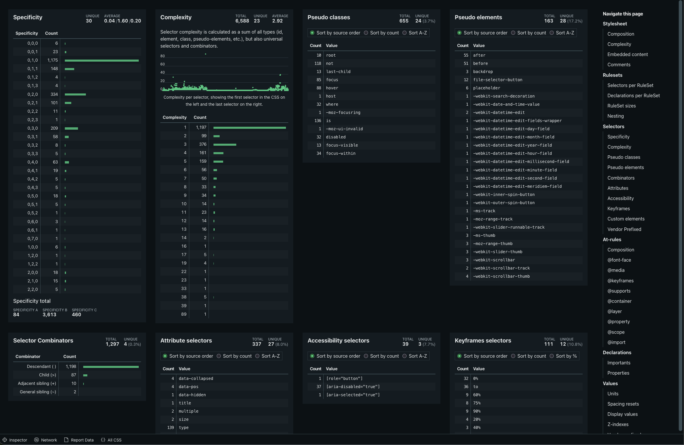
Our CSS analyzer page gives you dozens of metrics about your CSS, so that page tends to take up a lot of vertical space. Optimizing that space is really hard, because it is impossible to predict how many accessibility selectors, prefixed keyframes or browserhack selectors a website has before showing the analysis report. Many analyzed websites ended up showing lots of empty space when viewing their reports:
And then, in December 2025, CSS-Tricks published “Masonry Layout is Now grid-lanes” with a small bullet point at the end of the article noting that a legacy implementation had been in Firefox for at least five years. Wait, that means I can use grid-lanes as progressive enhancement to make my grid take up less space? Let’s give that a shot! Here is what I ended up writing by the end of February this year:
.report-section {
	display: grid;
	grid-template-columns: repeat(auto-fit, minmax(24rem, 1fr));

	/* Use legacy masonry rows if grid-lanes is explicitly not supported */
	@supports (grid-template-rows: masonry) and (not (display: grid-lanes)) {
		grid-template-rows: masonry;
	}

	/* Use grid-lanes when supported */
	@supports (display: grid-lanes) {
		display: grid-lanes;
	}
}
A small breakdown:
- This uses
@supportsat-rules to feature detect either of the syntaxes; - Enable legacy
masonrysyntax withgrid-template-rows: masonry; - Enable modern
grid-lanesby overriding the existingdisplay: gridwithdisplay: grid-lanes; - Browsers that support neither of those will display the ‘before’ grid-like structure.
The chances of it are very small, but just in case Firefox would support both masonry and grid-lanes at the same time I added the negation case in the supports at-rule. My goal here is to use grid-lanes whenever possible and only use masonry if that’s the only supported feature.
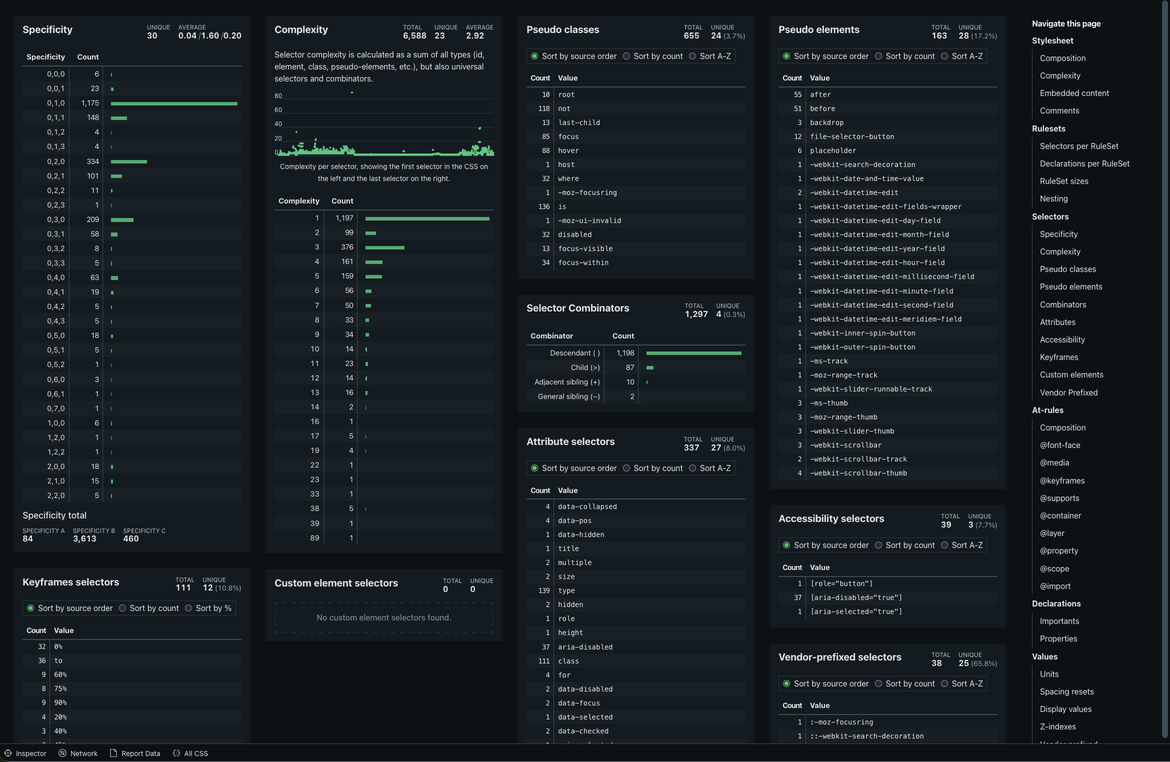
The resulting webpage is now a lot more dense, fitting more metrics in the viewport:
Popular posts
Making Analyze CSS render 6 times faster
A deep-dive in how the Analyze CSS page renders 6 times faster by applying 2 basic principles.
CSS complexity: it's complicated
There's lots of places in CSS to have complexity, but we tend to focus on selectors most of the time. Let's have a look at other places too.